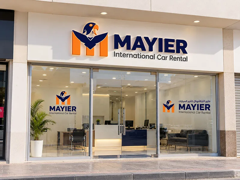
Everyone has an opinion about logos, and most of the time it starts with “I like it” or “I don’t like it”. Taste matters a little, but it is not what makes a logo work. A good business logo does a specific job: it helps people recognise you, remember you and trust you.
Here are seven practical tests we use when we design and review logos for businesses in Dubai and across the UAE.
1. Is it simple enough to remember?
Close your eyes after looking at a logo for five seconds. Could you sketch it roughly? The strongest logos are often surprisingly simple: a clear shape, one or two colours, a readable name. Detail that looks impressive on a big screen usually disappears in real life.
2. Does it work at small sizes?
Your logo will appear as a tiny icon far more often than as a big sign: in a browser tab, on a social media profile, in a WhatsApp chat, on a pen. Shrink it down to the size of a fingernail. If it turns into a blur, it needs simplifying or a separate small version.
3. Does it work in one colour?
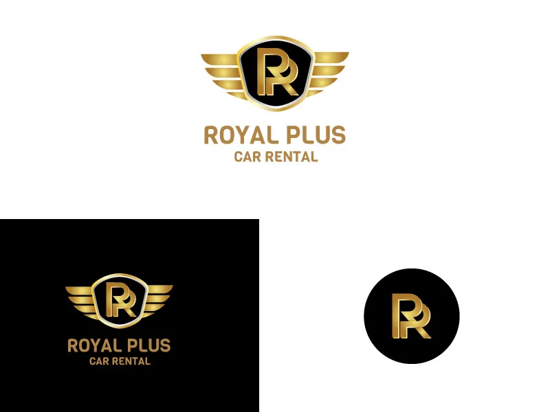
Logos get printed in black on invoices, embossed on paper, engraved on metal and stitched on uniforms. Look at your logo in solid black and in solid white on a dark background. If it only works with gradients or many colours, you will struggle later.
4. Does it suit your customers, not just you?
A playful, colourful logo might be perfect for a children’s café and completely wrong for a law firm. A good logo speaks to the people you want to attract. Ask yourself whether your ideal customer would feel this business is “for them”.
5. Is it different from your competitors?
Put your logo next to the logos of five competitors. If it blends in, with the same colours, the same type of icon or the same style of lettering, customers will struggle to tell you apart. Being different, in a way that still fits your industry, is a big advantage.
6. Does it work in Arabic and English?
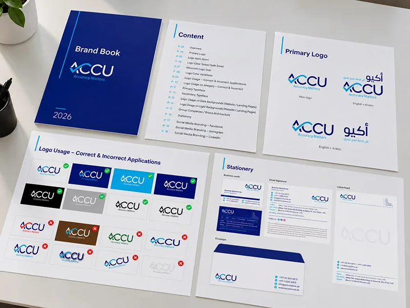
For most UAE businesses, the logo needs to work bilingually. A good bilingual logo gives both scripts equal care, with balanced weight and spacing, so the Arabic never looks like an afterthought. You can see examples in our Arabic and English logo design work.
7. Will it still look right in five years?
Trends come and go quickly. Very fashionable effects can make a logo look dated fast. Aim for something that feels modern but not trendy. You can always refresh the surrounding brand, such as photography and social media style, without changing the logo itself.
Common logo mistakes we see
- Too many ideas in one mark. A logo does not need to explain everything you do.
- Hard-to-read fonts. Script fonts can look elegant but often fail on signage and small screens.
- Copying a famous brand. It might feel safe, but it makes you look like an imitation and can cause legal problems.
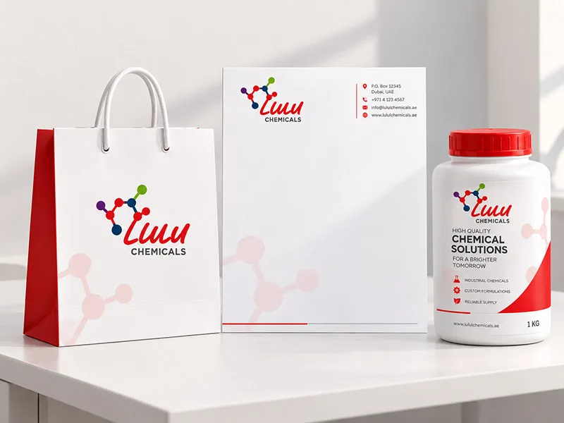
- Designing only for the screen. Always check how the logo will look on your real signage, packaging and vehicles.
How we approach logo design
When we design a logo, we start with your business and your customers, explore several different directions and then test the strongest one in real situations: signage, stationery, packaging and social media. It is the most reliable way to end up with a logo that works hard for years.
If you are not sure whether your current logo passes these tests, ask us for an honest opinion. Sometimes a small refresh is all it needs.